|
Important Rules to Follow When Choosing a Logo Design
When ever you are choosing a logo design it is important to decide on the logo while it is in it's purest form; simple black and white. No color, no beveling, no gradients, no framing and no effects. Think of your logo as if you are seeing it on a poor quality black and white fax machine. The point here is that if your logo looks good, reads well and communicates your brand in black and white then 90% of the real work has been done. Any coloring or effects added afterward is easy; but just as important. See: What Makes a Great Logo Design! |
||
 |
 |
 |
| Design
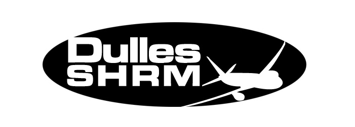
1 - Upper and lower case mix of designed text typography reversed in oval element with iconic commercial jet in flight. |
Design
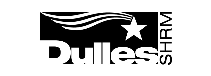
2 - Upper and lower case mix of designed text typography with iconic derivative of the US flag , designed to convey 'fluid motion' and 'patriotism'. |
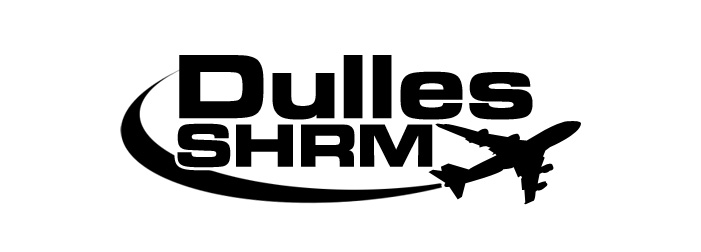
Design
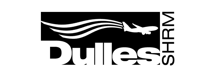
3 - Upper and lower case mixed designed text typography with iconic commercial jet in flight and motion trail element behind the jet. |
 |
 |
|
| Design
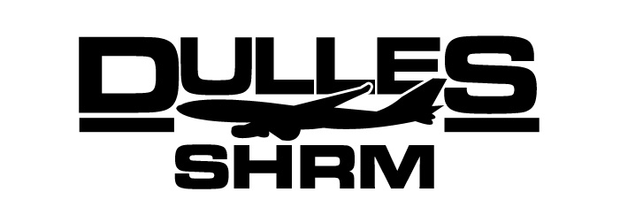
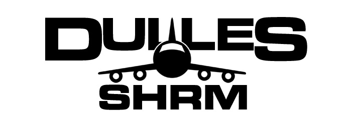
4 - All upper case designed typography with centered iconic commercial jet in flight overlapping DULLES lettering. |
Design
5 - All upper case designed typography with front facing, centered iconic commercial jet. |
Design
6- All upper case bold and light designed typography with iconic commercial jet in flight with motion element to convey 'DULLES' as a pivotal hub for landing and departure. |
 |
 |
|
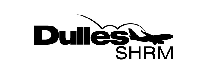
Design
7 - Upper and lower case mixed designed typography with swoosh element and iconic commercial jet in flight. |
Design
8- All upper case designed typography with iconic commercial jet in flight and 'faded' motion trail element added behind the jet. |
. |